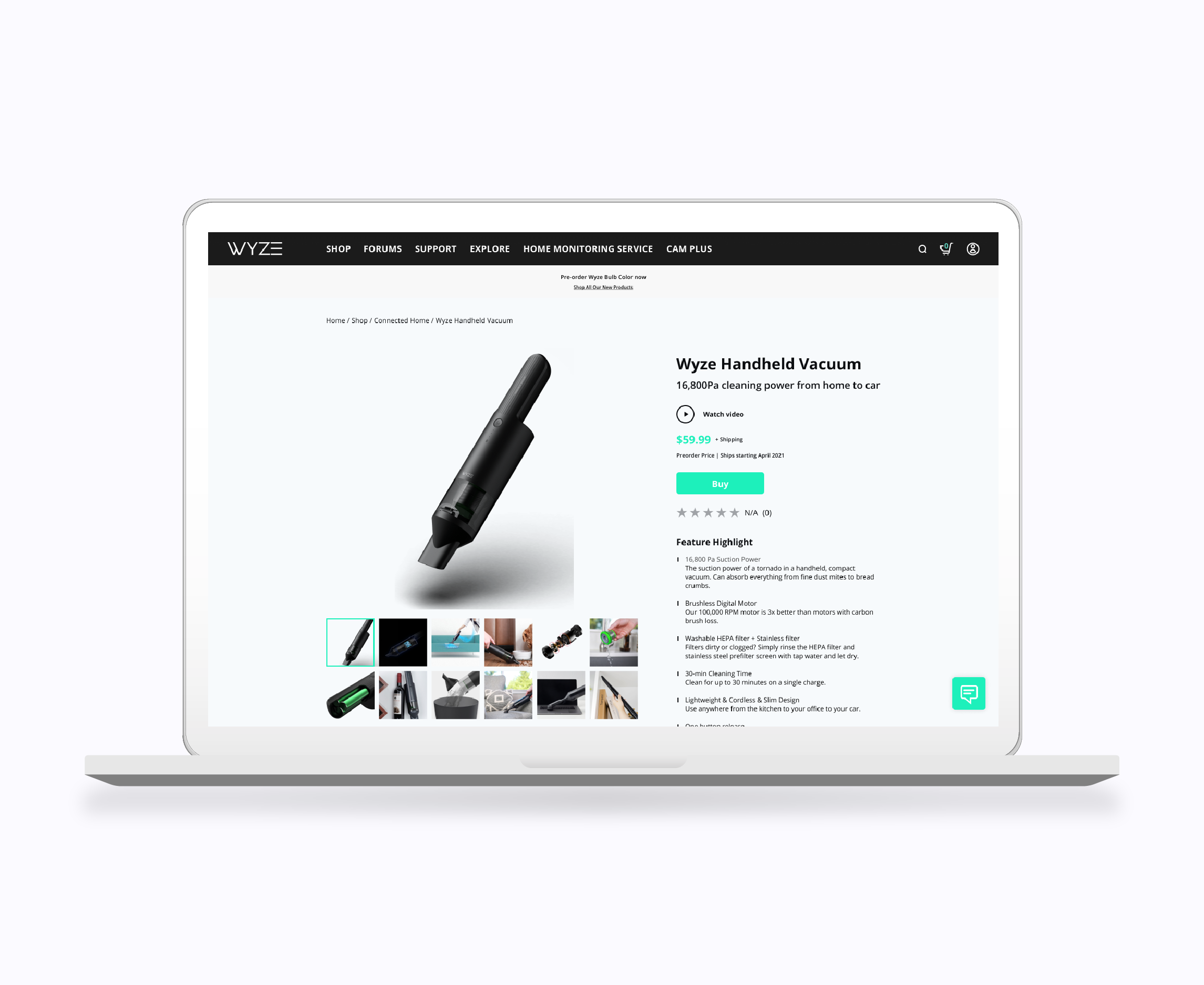
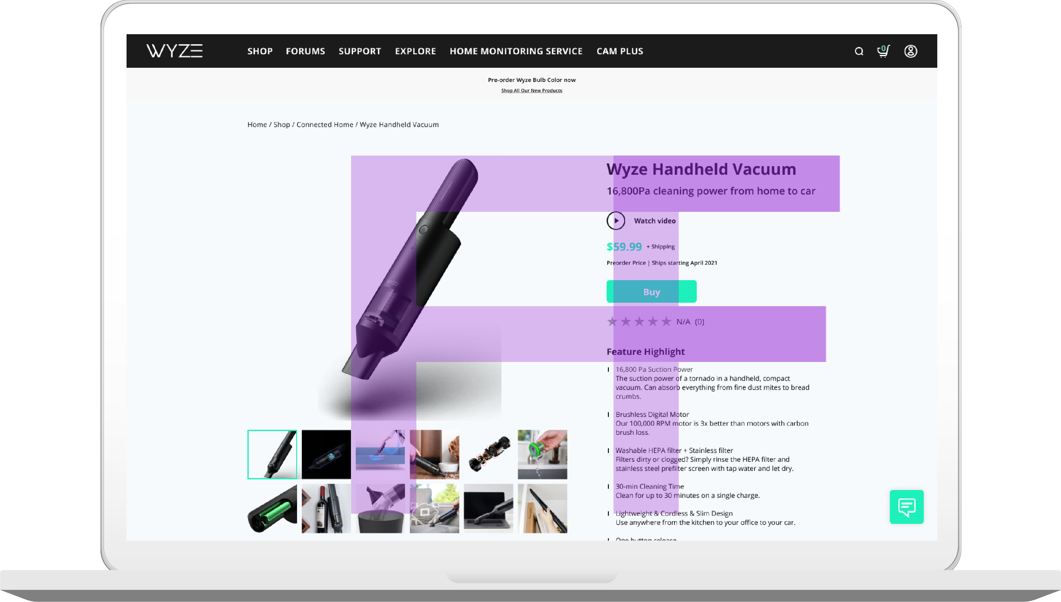
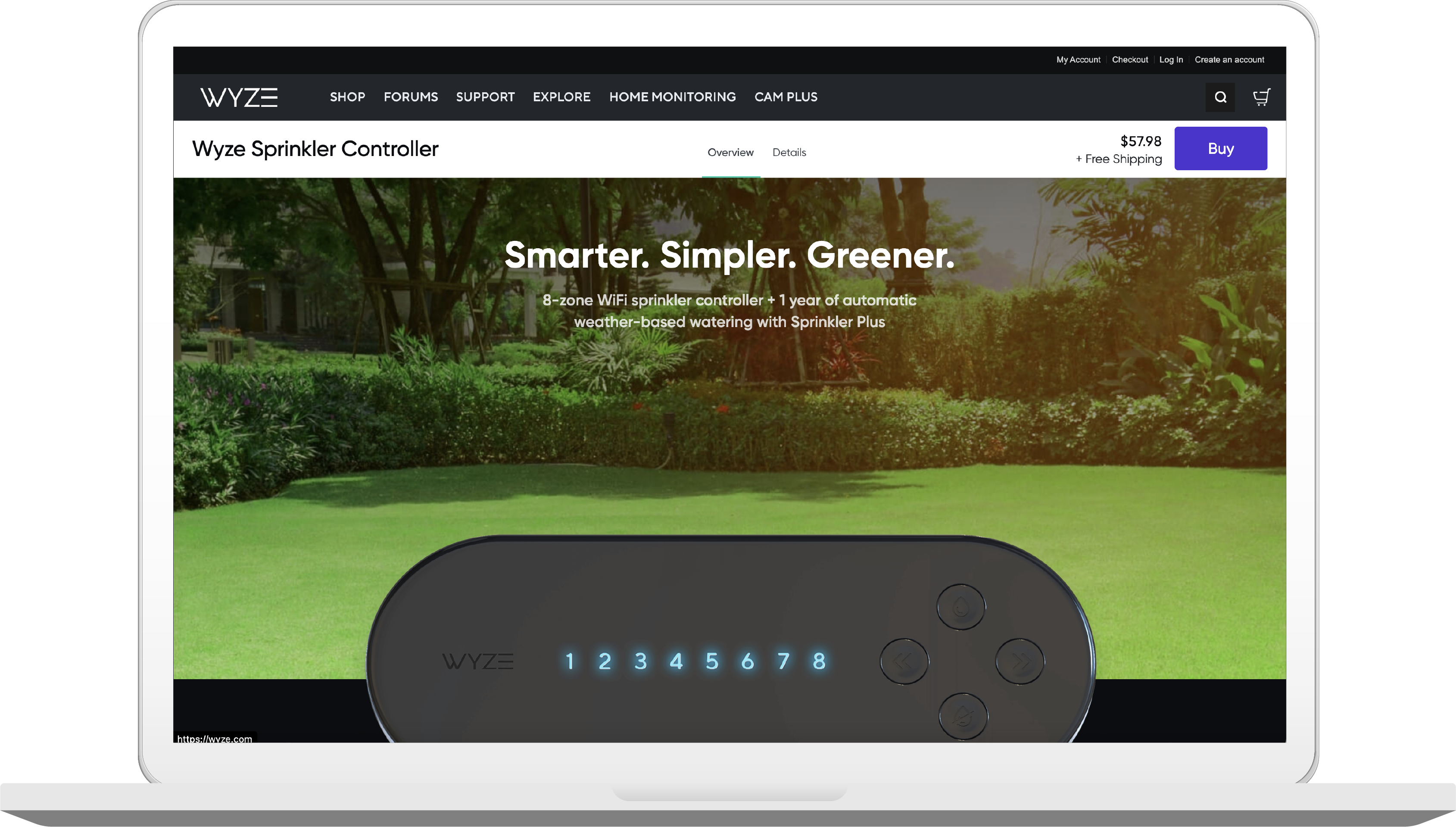
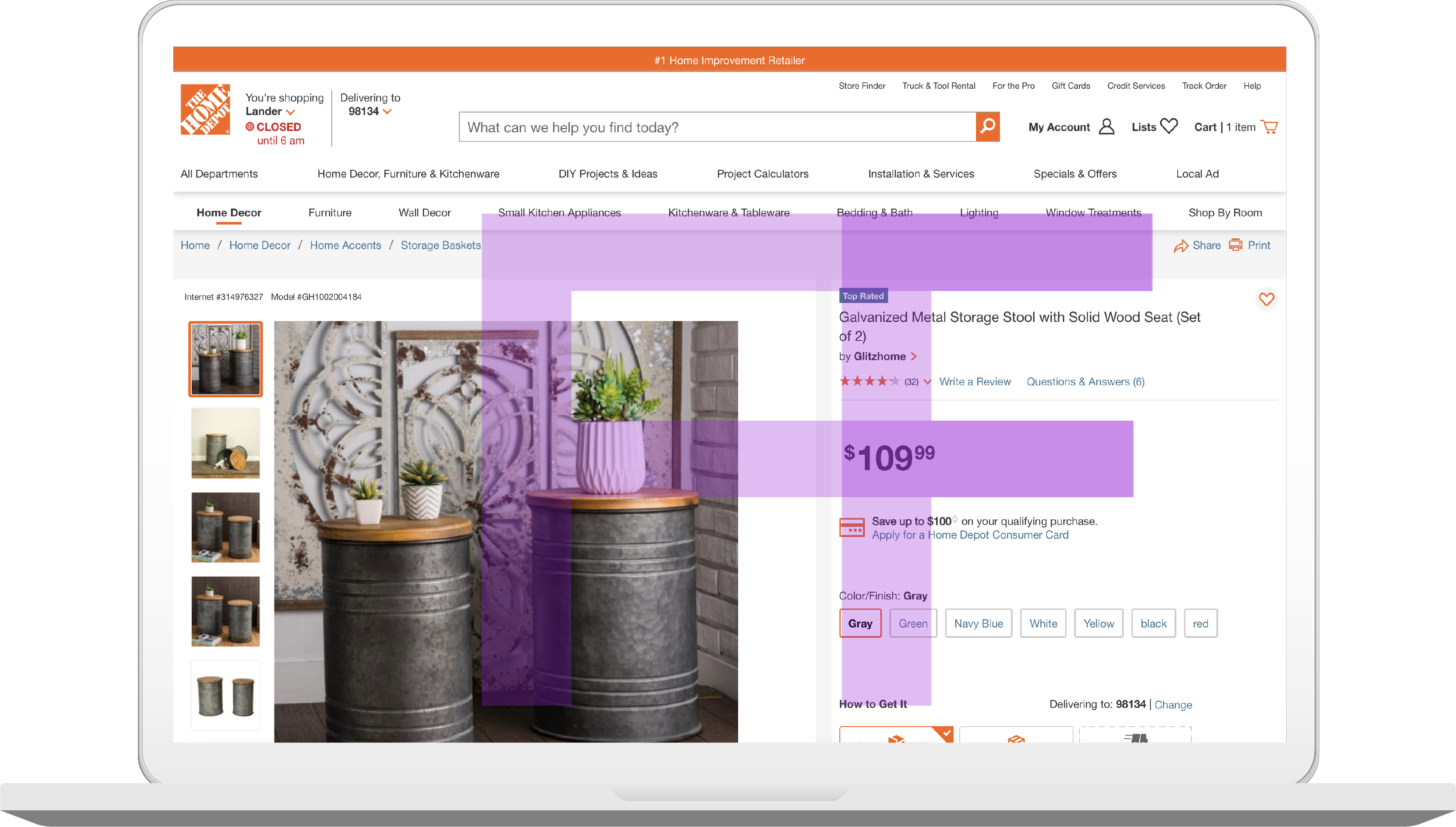
Wyze Lab
eCommerce Website Product Page

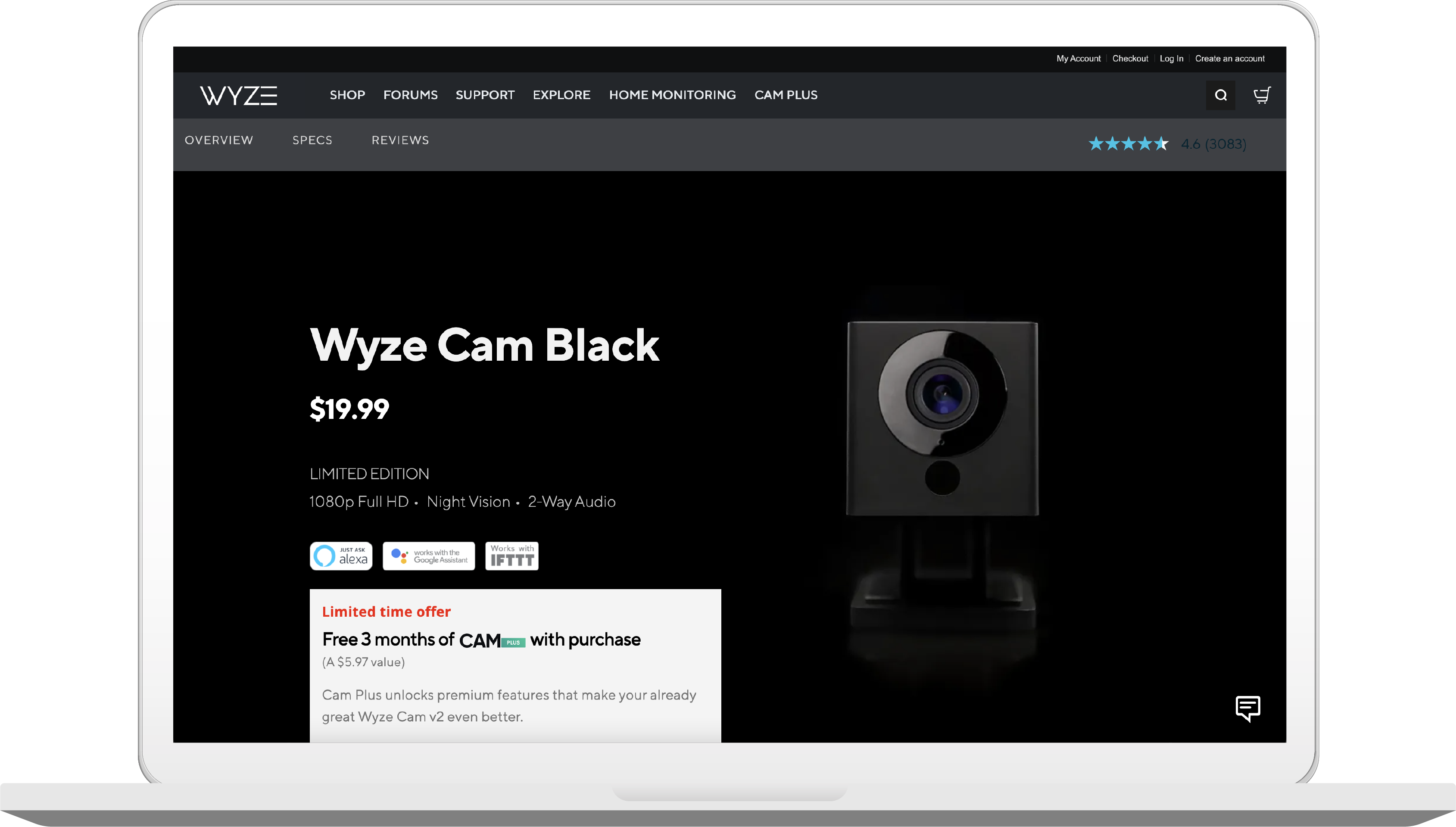
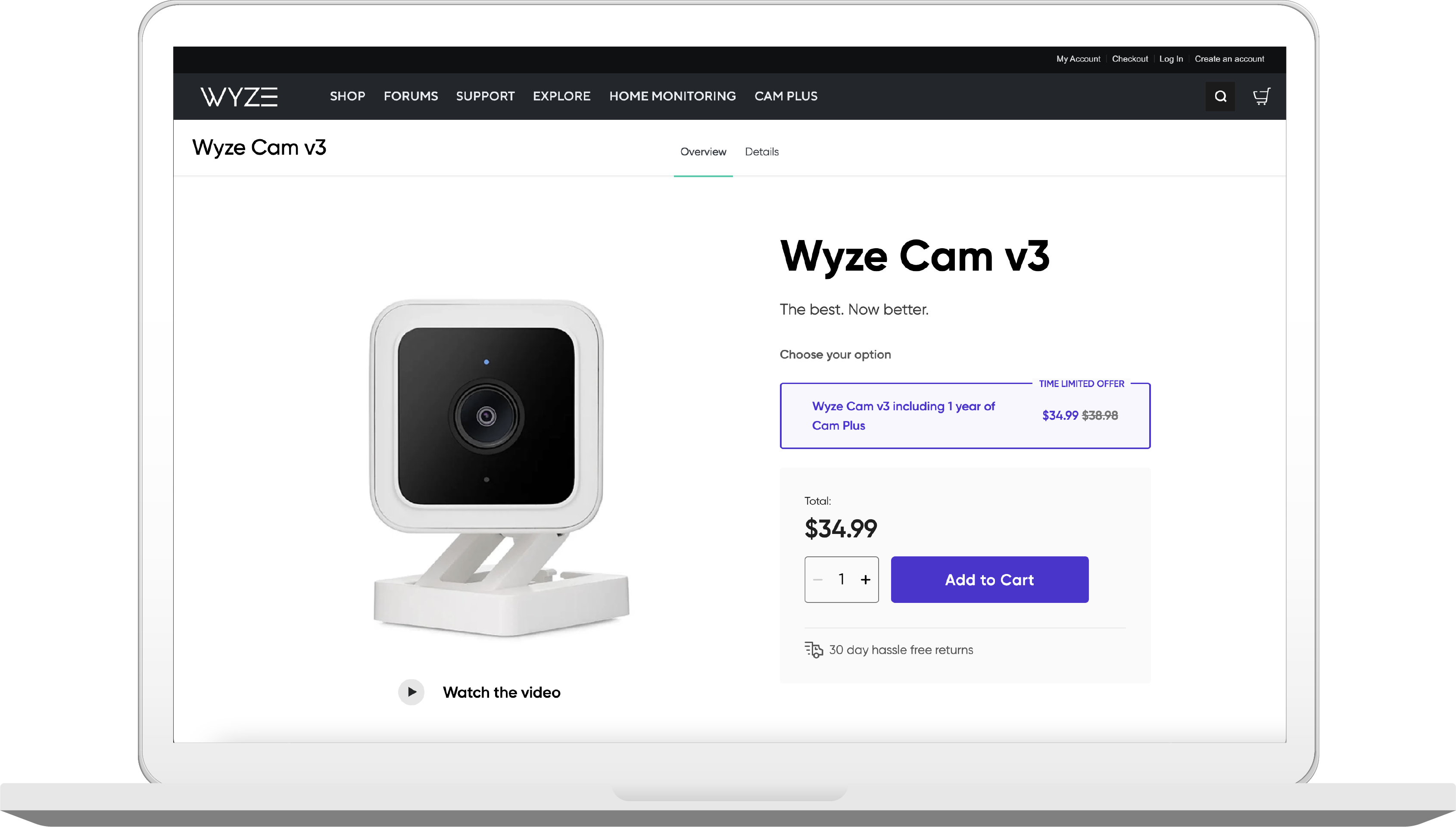
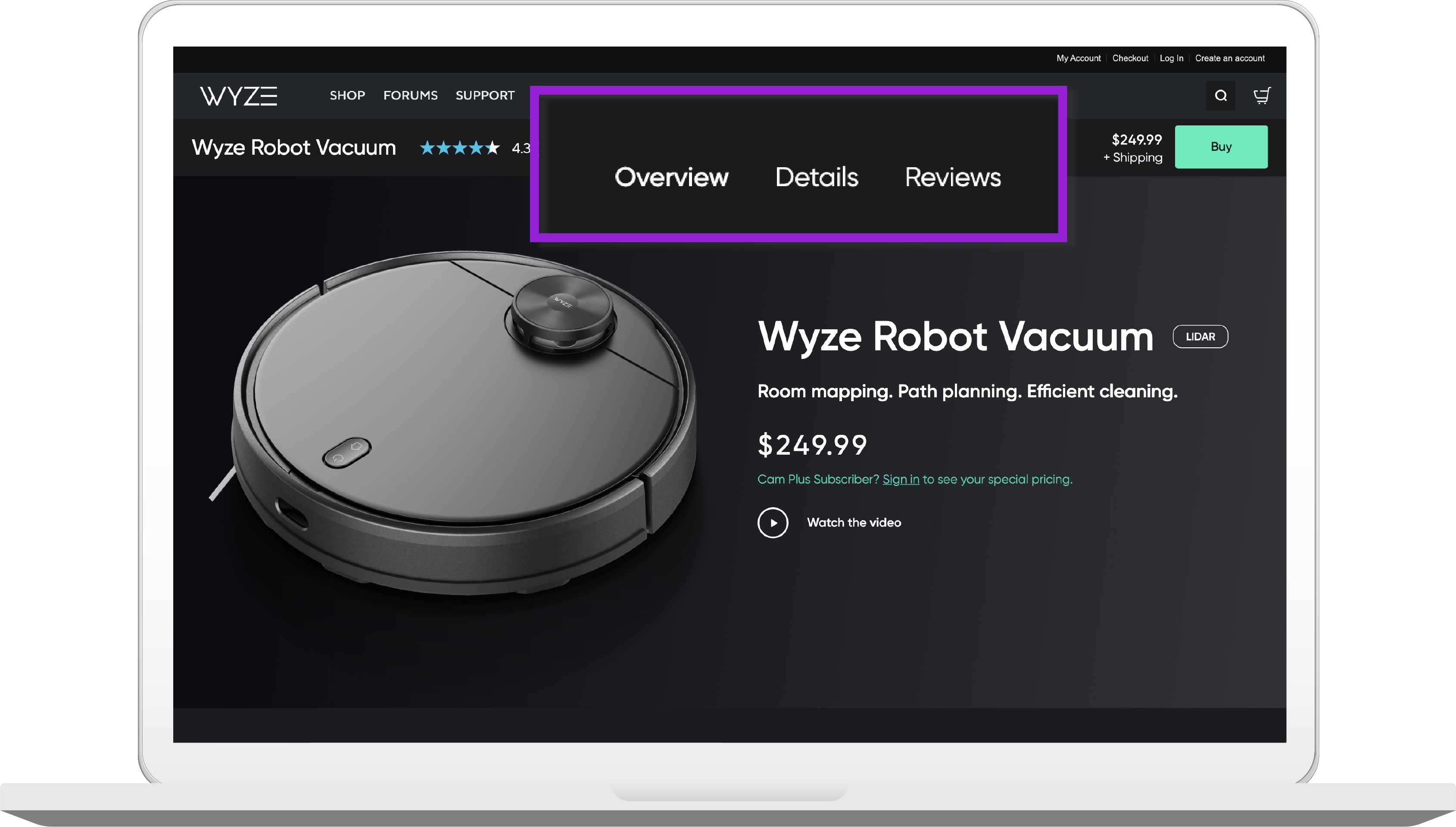
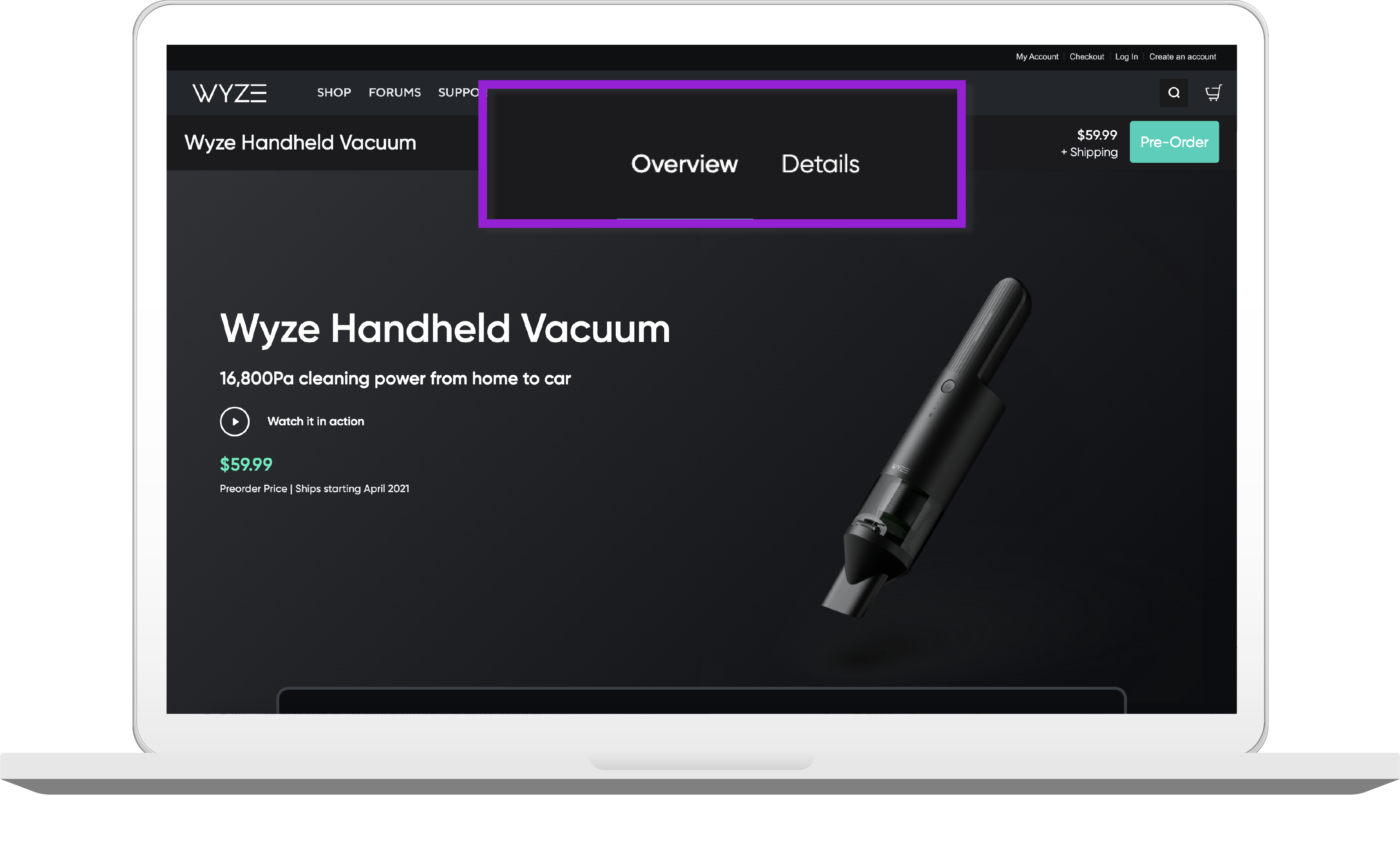
Wyze Lab is a smart home IOT startup that is currenly growing faster than ever. However, Wyze's ecommerce website has many design debts. In this project, I directly presented a product page redesign pitch focusing on consistency to the ecommerce team in hope of improving the website experience.

Next Project Next Project Next Project
Previous Project Previous Project Back

Project Overview

Wyze is striving to grow as a startup as fast as possible. In order to be able to ship out content and keep up with the speed they release their physical products, the ecommerce website did not get a chance to set up a good design foundation and results to design debts build-ups. Fortunately, I had the opportunity to present some of my redesign ideas to the ecommerce team. There were many aspects I tackled on in the pitch, however, I will only focus on the product page inconsistent issue for this case study.

Timeline

February 2021 (1 weeks)

Role

Product Designer

Context

Direct Design Pitch

The Problem

How might we provide consistent and effective product browsing experience for Wyze customers?

Wyze eCommerce website lacks consistencies within the site itself and with the conventional ecommerce practices in general. The most problematic inconsistency out of all being all product pages have different layouts and designs, resulting to customers having a hard time locating information, and thus detering their desire to place order on the website.

Design Solution

The layout redesign adopted an "F" shape pattern layout, minimum image gallery truncation, and interactive combination of image and text description of the products to provide more effective scan on product information and maximum exposure to important action.

01

F Pattern Page Layout

  • Best fit for eye-scanning patterns
  • Familiar to customer's year of online shopping traning
  • Minimum truncation to uncover important information

02

Scroll and Dropdown Animation

  • Calls for customer's attention to previously neglected action
  • Sticky header wil drop down once users scroll pass the buy button
  • Convenient action button

03

Interactive Descriptive Text and Image Gallery Combination

  • Paired text and image to maximize product information communicating efficiency
  • Image and Features side by side with close proximity
  • Interacting animation to highlight current viewing item

04

Light UI for Text Heavy Content

Reasoning

While the original dark UI design creates a luxurious and dramatic effect for the product, it sacrifices readiblity. According to Toptal, dark UI should only be used with sparse and minimal text. With the amount of descriptive text, while not exactly heavy with text, the content cannot be consider as "sparse" nor "minimal". Hence the light UI.

The Outcome

I proposed my design directly to the head of e-commerce of Wyze and recieved an extremely positive feedback. I even had a chance to discuss and compare my design to their current WIP design with their product designers to further validate my creation. The success metrics I set for this project that I have confidence would have been achievable are

  • Higher conversion rate for the website
  • Decreased time needed for the customers to place an order

Takeaway

Why certain layouts are so popular

Innovation and creativities are qualities us designers constantly strive to achieve. However, sometimes, popular patterns become popular because they work. They are results based on rich usability research studies, and ecommerce website product page is a prime example of this. However, the key to creating a great product page is not just following the pattern, but also taking notes of details that could collaterally provide the most effective and inducing experience for the customers.

1.0 The Research

1.1 Methods

1 Heuristic Evaluation

I first conducted heuristic evaluation to identify porminent issues the website has, and formed a couple of assumptions on the usability issues.

2 Guerilla Testing

I conducted 5 rounds of Guerilla testing to help me validate the assumptions I had.

1.2 Key Insights

Below are some of the most important violations to usability and some findings I gathered:

Consistency and standards

Like mentioned repeatedly, the biggest issue for the product is that Wyze does not have a consistent layout for all product. The button placement can be different from product A to product B, the UI color scheme can be dark in for some products while the rest adopted light UI, the wording of some of the actions can also be different. Not to mention that the product layout is very different from established industry conventions. All of these led to an immense amout of user's cognitive load.


Aesthetic and minimalist design

This issue goes kind of hand in hand with the aforementioned issue. As some of the designs are widely different from conventional design, they adopted a very dramatic and luxurious layout style, namely using huge and extravagant product image types and layouts. Resulting to users being distracted from the real informative text and content where they could learn about the product.

Current design inconsistency

  • Different button placement
  • Different UI scheme
  • Different wordings
  • Different layout

Visisbility of system status

The design omits the link to reviews directly when the product hasn't received any reviews instead of informing the customers that there is simply 0 review at the moment. This led to customers being confused as to why they are not finding the review section, and became doubtful of the brand.

System status not provided

For exemple, when there is no review for a product yet, the design omits the link all together.

Help and documentation.

According to eConsultancy, 31% of online shoppers said they are more likely to make purchase after live chat experience. Wyze has live chat. However, they are not presenting it and not making it obvious for their customers. Some page has a text link that activates it, while some page straight out omits it. This is a huge loss of opportunities for Wyze.

2.0 Ideation & Iteration

2.1 Competitive Analysis

Understanding the F shape pattern and other industry practices.

Before starting the iteration process, I referred to Baymard Institue's research studies and conducted competitor analysis on benchmark websites to help me understand current practices and the design principles of the usability results behind those practices.

The Home Depot

Pros

  • Informative descriptive text and image
  • Complete alternative product comparisonss
  • Complete action variety e.g. Send notif when in stock, shipping/pickup options, etc...
  • Videos to help demonstrate product
  • Quick access to main actions when scrolled down

Cons

  • Truncating images in the gallery
  • Main action: buy button hierarchy layout too low (default position)

Lowe's

Pros

  • Clean and informative F shape layout.
  • Complete alternative product comparisons
  • Complete action variety
  • 360° help demonstrate product
  • Quick access to main actions
  • Abundant user-generated feedback

Cons

  • Truncating images and most information.
  • Multiple-column and low scannability spec sheet

Crutchfield

Pros

  • Clear call to action button
  • Complete related product comparisons
  • Abundant user generated feedback and QAs
  • Effective combination of descriptive text and images

Cons

  • Horizontal tabs covering up information
  • Lack of spec sheet
  • Long scroll with no quick access back to main section

2.2 Synthesized Findings

The logic behind F-Shape pattern.

Users scan websites in an F shape pattern is a well-known fact. This also highly contributed to the current industry conventional design of product page. Since location does play a huge part of the visiblity of the information, it is important to place key action and information where the customers will see first and foremost.

The Home Depot's product page design

The Home Depot's eCommerce website has the highest performance mark in all benchmark case studies, specifically exceling at its product page design, and it also adopts the F-shapa pattern.

Customers miss out images truncated in the image more than you realized.

According to Baymard Institute usability studies, a surprisingly large amount of users, 50-80% of them in fact, overlook all of the truncated images in the produtcgallery.

If the users can't find the information, the information doesn't exist.

According to Baymard Institute, 27% of users overlook hidden content in the horizontal tabs. This is validated during my testing when 2 out of the 5 participants did not notice the horizontal sticky tab once, and thus not having the opportunity to learn some of the most important product information, such as features and specs. As the institute said, information that doesn't exist may as well not be there. In Wyze case, this is extremely detrimental because the design hid all important information in the horizontal tab.

Current Designs

Some of the design on Wyze's product page adopted a horizontal sticky tab on the header, which contains links to product details and product reviews (both invisible if customers do not click on the link), and customers do in fact overlook it.

Incorporate a combination of descriptive text and image to strike for the most informative information

Image can effectively help customers evaluate product. However, it solely relies on communicating information visually. Text on the other hand can be extremely descriptive and informing, but on its own, users don't tend to read long product descriptions. So best practice would be combining both images and text to complement each's gaps.

Walmart's product page text description

The text description on Walmart's product page is long and in-depth. However, for the customers, this might seem intimidating, and they might be unwilling to read through it.

2.1 Design Challenges

During the decision process, I came upon some design challenges I had to make, below are a few of them:

How might we call attention to content and action?

I like the idea of Wyze having a sitcky header up-top containing the key action - buy button. Unfortunately, according to my research, customers overlook it and when that happen, the value of having a shortcut sticky on-top is lost. So I decided to incorporate interaction design to combat this issue and call the customers' attention with animation.

The dropdown animation

Once the customer scrolled pass the key action item, the sticky header will roll down in animation to call attention to the now available shortcut.

Maximizing product information communication effect with text/image combination and animation

In order to fulfill the practice of letting descriptive text and images fill up one another's gap in information telling, I wanted to pair those two in close proximity in one view. I designed an interaction animation of having the corresponding descriptive text of the selected image highlighted to call attention to the content.

The text/image design

Once the customer click on to the image, the corresponding descriptive text will be highlighted to further communicate the product information.

Limitation

Aside from time limitation as I only have less than a week to complete the entire pitch, I also acknowledge many design limitation. In order to focus on improving the inconsistence issues on product page, I chose to not further incorporate many other opportunities, such as providing more additional action buttons or exploring the cross selling opportunities for similar and related product.